 Image 1 of 41

 Image 2 of 41

 Image 3 of 41

 Image 4 of 41

 Image 5 of 41

 Image 6 of 41

 Image 7 of 41

 Image 8 of 41

 Image 9 of 41

 Image 10 of 41

 Image 11 of 41

 Image 12 of 41

 Image 13 of 41

 Image 14 of 41

 Image 15 of 41

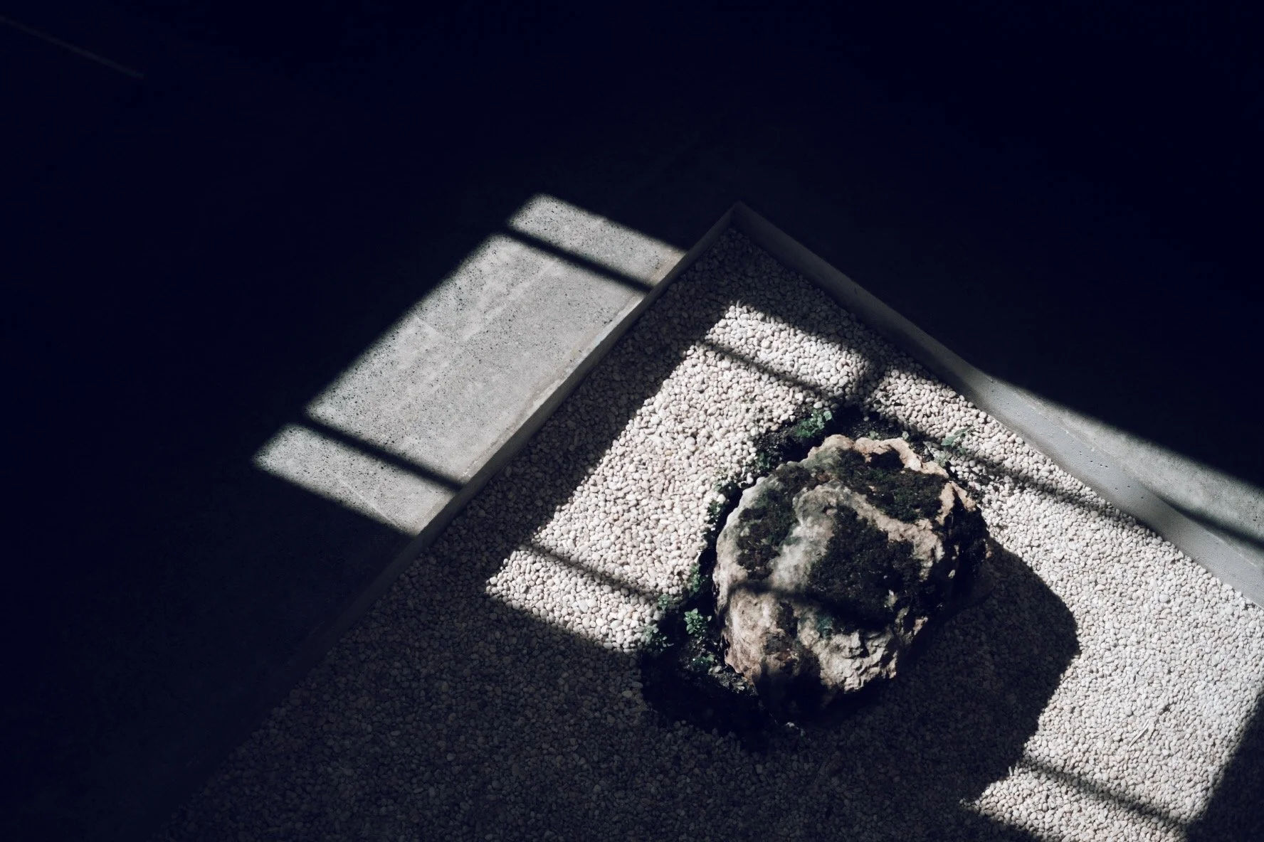 Image 16 of 41

 Image 17 of 41

 Image 18 of 41

 Image 19 of 41

 Image 20 of 41

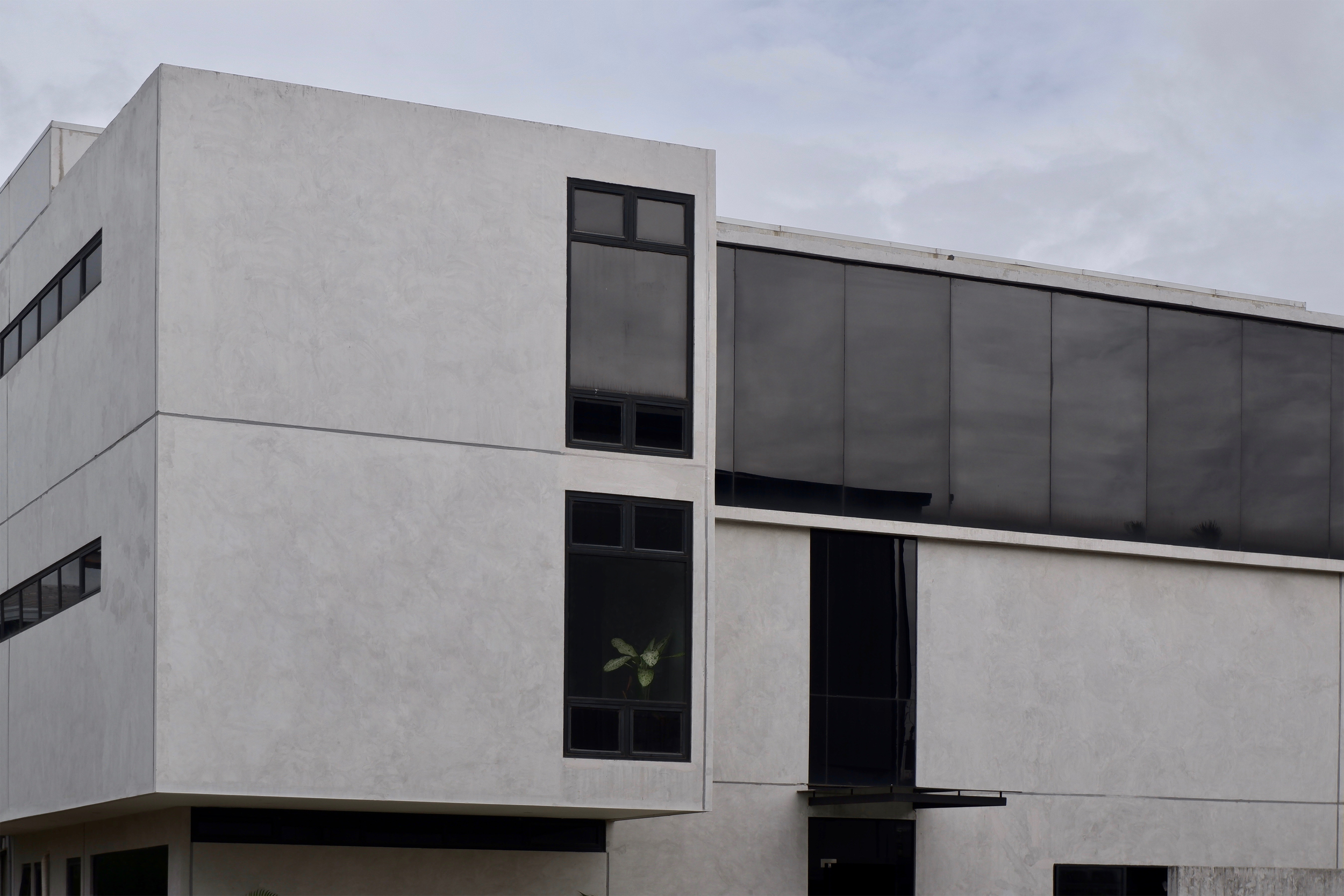 Image 21 of 41

 Image 22 of 41

 Image 23 of 41

 Image 24 of 41

 Image 25 of 41

 Image 26 of 41

 Image 27 of 41

 Image 28 of 41

 Image 29 of 41

 Image 30 of 41

 Image 31 of 41

 Image 32 of 41

 Image 33 of 41

 Image 34 of 41

 Image 35 of 41

 Image 36 of 41

 Image 37 of 41

 Image 38 of 41

 Image 39 of 41

 Image 40 of 41

 Image 41 of 41


MAIN CONCEPTS:
a.Spaces — Since the building houses three different but affiliated companies, we wanted to give each department distinct and private spaces while still allowing easy collaboration and communication among all. The design achieves this by punching through the center of the mass to make way for a lightwell and a small garden, and allowing office spaces to open towards this atrium.
b.Experience — We wanted to break the stereotypical office feel. We want the space to feel calming, peaceful, and inspiring. The simplicity of the structure bring our focus to appreciate the surrounding nature, the changing light and shadows throughout the day, the views framed by openings. The high ceilings and double volumes also inspire creativity.
“People often say that this building doesn’t feel like an office, and that is because oftentimes, we spend more time in our offices than we do in our own homes. We designed this space to be an extension of our homes, a place that inspires productivity but also gives a sense of peace and calmness. This project was definitely one that heightened the appreciation for concrete as a beautiful canvas for light and shadow, for wood and the warmth they bring to spaces, for pockets of greens, for that balance of visual transparency and privacy, for allowing nature to (along with the sound of birds chirping) to be part of spaces, for finding beauty in little imperfections. “
c.Materials — We wanted to highlight the natural qualities of materials. This also highlights in the material the beauty of time passing, witnessing the subtle yet beautiful ways that they age and weather through time.This reminds us of Pallasmaa’s fascination about natural materials which “express their age, as well as the story of their origins and history of human use, all existing in the the continuum of time”. (Pallasmaa, The Eyes of the Skin)
The flooring is simply polished concrete which gives a nice terrazzo-like effect. The walls are of precast concrete. Since they’re fabricated in a controlled environment, quality after casting is already good so there is very minimal or close to no finishing required. The steel structure and glass partitions are complemented by the warmth of wood elements. The wood slats on the ceiling also give the place a sense of unity and connectivity.
d.Sustainability — Enveloped by precast concrete, the project was constructed with minimal waste as each panel was tailored and casted specifically for each part. It’s almost like a puzzle piece that’s simply assembled on site. Since it’s made out of modular components, the panels can be dis-assembled and re-assembled in the future, should changes of needs arise.
The lightwell and vent in the center also acts as an escape for hot air and promotes cross ventilation within the office. The communal areas remain cool and comfortable despite the harsh heat of the sun.
PRODUCT INFORMATION
Project Name: Three-Storey Precast Office Building
Project Status: Completed
Completion Year: 2019
Project Location: Mandaue City, Cebu
Publications:
