 Image 1 of 32

 Image 2 of 32

 Image 3 of 32

 Image 4 of 32

 Image 5 of 32

 Image 6 of 32

 Image 7 of 32

 Image 8 of 32

 Image 9 of 32

 Image 10 of 32

 Image 11 of 32

 Image 12 of 32

 Image 13 of 32

 Image 14 of 32

 Image 15 of 32

 Image 16 of 32

 Image 17 of 32

 Image 18 of 32

 Image 19 of 32

 Image 20 of 32

 Image 21 of 32

 Image 22 of 32

 Image 23 of 32

 Image 24 of 32

 Image 25 of 32

 Image 26 of 32

 Image 27 of 32

 Image 28 of 32

 Image 29 of 32

 Image 30 of 32

 Image 31 of 32

 Image 32 of 32


The project started with us talking to our client for hours over coffee and learning about their large variety of coffee products, their values, and aspirations. The Good Cup Coffee is founded by Philippine Brewers’ Cup Winner Gio Visitacion, who aims to not only create a distinct coffee experience for Cebuanos but also educate and eventually elevate local coffee. Nestled in one of Cebu City’s old buildings in a busy street called Ramos, our client envisioned a fresh and new look for their existing coffee shop. Their inspiring stories set the tone and overall direction of the design.
Facade
Tucked in between a row of shops, the quaint coffee shop subtly catches your attention with a minimal glowing white signage and clear glass giving a peak of its interiors. Originally, we designed the light box to glow in all sides but we later on realized that allowing the whole bottom side to glow would entail more maintenance issues in the long run. We were torn between going for an all white surface or a reflective surface. Despite a few hesitations, we felt that having a reflective bottom would would make its experience more interactive and dynamic . This somehow created a connection between inside and outside. Sitting inside the cafe, you can see people and cars passing by outside. Looking from the outside, you can see the cafe interiors and the customers.
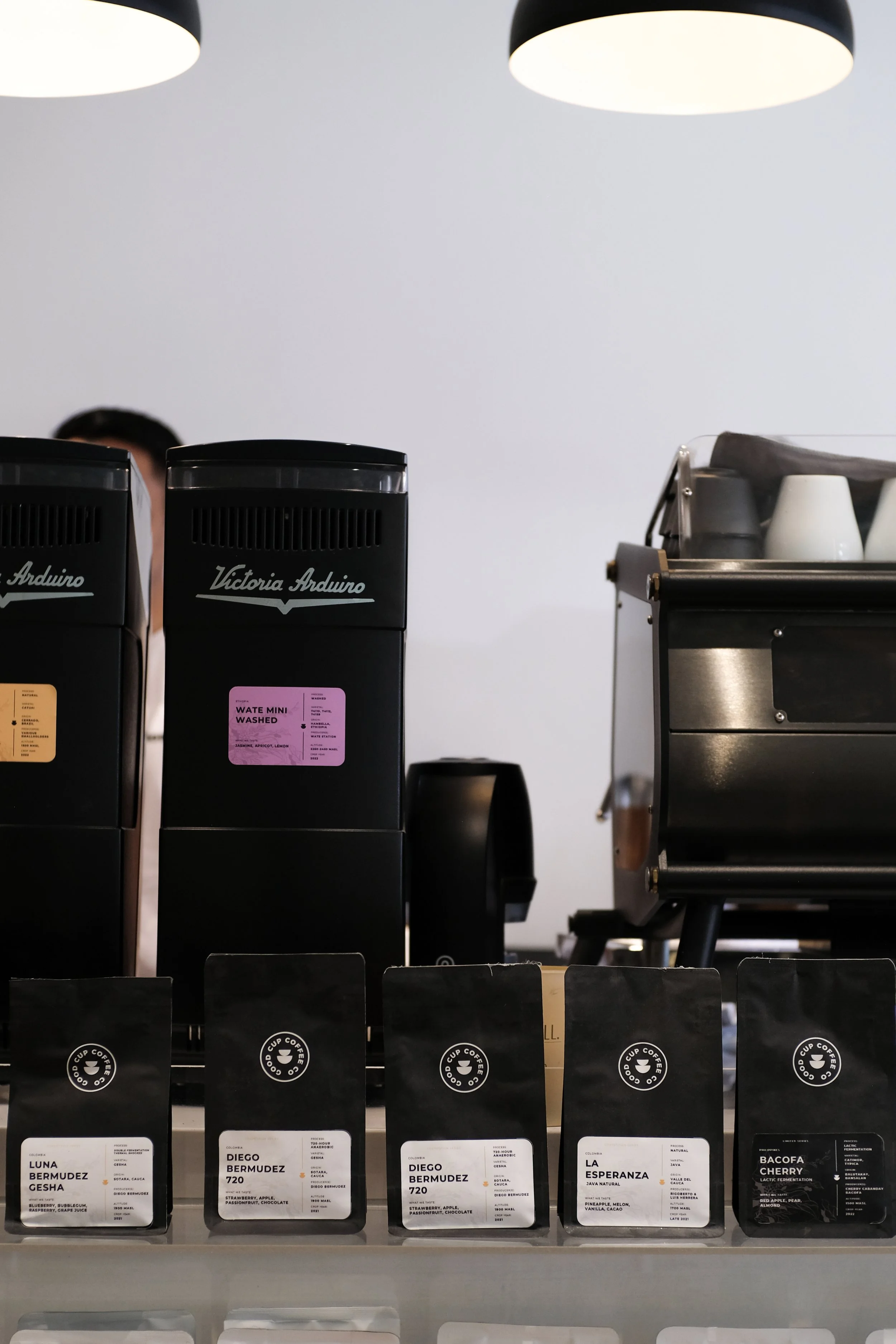
What makes Good Cup different from other coffee shops is the range of beans that they offer to customers. This is perhaps why the first thing you'll probably notice when you enter the coffee shop are the rows of coffee beans on floating acrylic shelves. Each type of bean tells a story and resonates differently with different kinds of people. We celebrated this by not only highlighting the products but making them a part of the design of the coffee counter itself. The colorful line of bean bags create a subtle yet striking contrast from the cafe's subdued and monochromatic interiors. In a way, they act like a secondary facade to the coffee shop, which can be seen by people passing by outside.
Details
An interesting detail that you would notice on the coffee counter and door handle is a symbol of a coffee bean with a map of Cebu which we CNC cut on gmelina wood. We first noticed this as a tiny symbol at the back of their coffee bean packages. We loved it so much we thought, why not make it part of the architecture?
Framed Views
One of the prominent features of the cafe interiors was the use of black accents to create framed views within the dominantly white space.
Furniture
In the spirit of dynamism and movement, most of the furniture is also modular and moveable. They are thoughtfully designed to maximize space and create multiple combinations and varieties based on the cafe’s needs.
As a fixed piece, a floating 6mm thick bended steel bench that extends from the entrance door to the stairs.
In terms of material, the furniture is mostly a combination of solid wood and brushed steel. We initially thought of using High Pressure Laminates for all wood pieces for lesser long term maintenance. However, upon further sampling, we found that the natural quality of solid wood evidently elevates the experience of the furniture pieces and an added warmth to the spaces. The varying grains and shades made each piece distinct and special.
One of the distinct pieces of furniture in the cafe is the "bean bench" where we’ve encased coffee beans of different roast levels on a grid of resin which now makes up the surface of the bench. What started out as a fun idea of sitting on a bed of coffee beans instantly became something we wanted to seriously execute. That isn't to say that there weren't many challenges getting to the final output. There were many things to consider — not only should the furniture function as a bench, but it should also function as additional storage compartments for the cafe. We had to make sure the bench cover would not slam shut by its weight, and lots of efforts to design it in such a way that would not be too overly complicated to drive costs up too high.
The Café Today
The Good Cup cafe is designed to be bustling with life and energy, to be a space where barista and customers can converse and interact, a place to not only enjoy but also learn more about coffee and to share all sorts of stories in between. In the end, we were able to achieve our client’s three main values: design that is straightforward, transparent and one that elevates and celebrates the coffee experience.
PROJECT INFORMATION
Project Name: Good Cup Coffee Renovation
Project Status: Completed
Completion Year: 2022
Project Location: Ramos Street, Cebu City
PUBLICATIONS
